A brand's visual aesthetics form one part of its marketplace distinction. Creating a compelling brand personality through visual tone requires understanding how colour schemes, typography, and imagery styles work together to forge an enduring brand identity that resonates with target audiences.
Brand personality mastery
Brand personality puts a human face on businesses, turning companies into characters that customers can connect with emotionally. Through their actions and communication, brands build distinct personalities across every customer touchpoint, from their visual style to how they behave and interact. Brand personality goes beyond just making people like you - it's a strategic approach to connecting meaningfully with specific customer groups. When a brand's voice matches what its target audience values and expects, everyday interactions become meaningful connections.
The key to effective brand personality is rock-solid consistency. Keeping your brand tone steady across all channels builds trust and reliability that resonates with audiences. This consistency shows people they can depend on you, turning satisfied customers into loyal advocates. A thoughtfully crafted brand personality generates genuine connections with audiences. When brands communicate in a way that truly reflects their values, they stand out in crowded markets whilst leaving lasting impressions that stick in people's minds.

(Source: Looka)
Brand personalities in action
Choosing your brand's personality trait includes picking what feels right and strategically identifying that resonates with your audience. One of the most widely-used frameworks for understanding brand personality comes from Jennifer Aaker, who developed a model that helps brands define their character.
The Aaker model outlines five key personality dimensions brands can embody: sincerity, excitement, competence, sophistication, and ruggedness. Most successful brands focus on one or two primary traits whilst balancing others to create a distinctive identity.
Sincerity
Sincere brands emphasise honesty and authenticity in their communication. They often use straightforward language and demonstrate genuine care for their customers and causes. For instance, Patagonia's "Don't Buy This Jacket" campaign showed their commitment to environmental sustainability over profit, strengthening their authentic, purpose-driven personality.

(Source: Adweek)
Sophistication
Sophisticated brands create an air of luxury and refinement. They often use fancy language, elite imagery, and focus on excellence. Consider how Rolex communicates - they emphasise heritage, precision, and timeless elegance rather than just telling time.
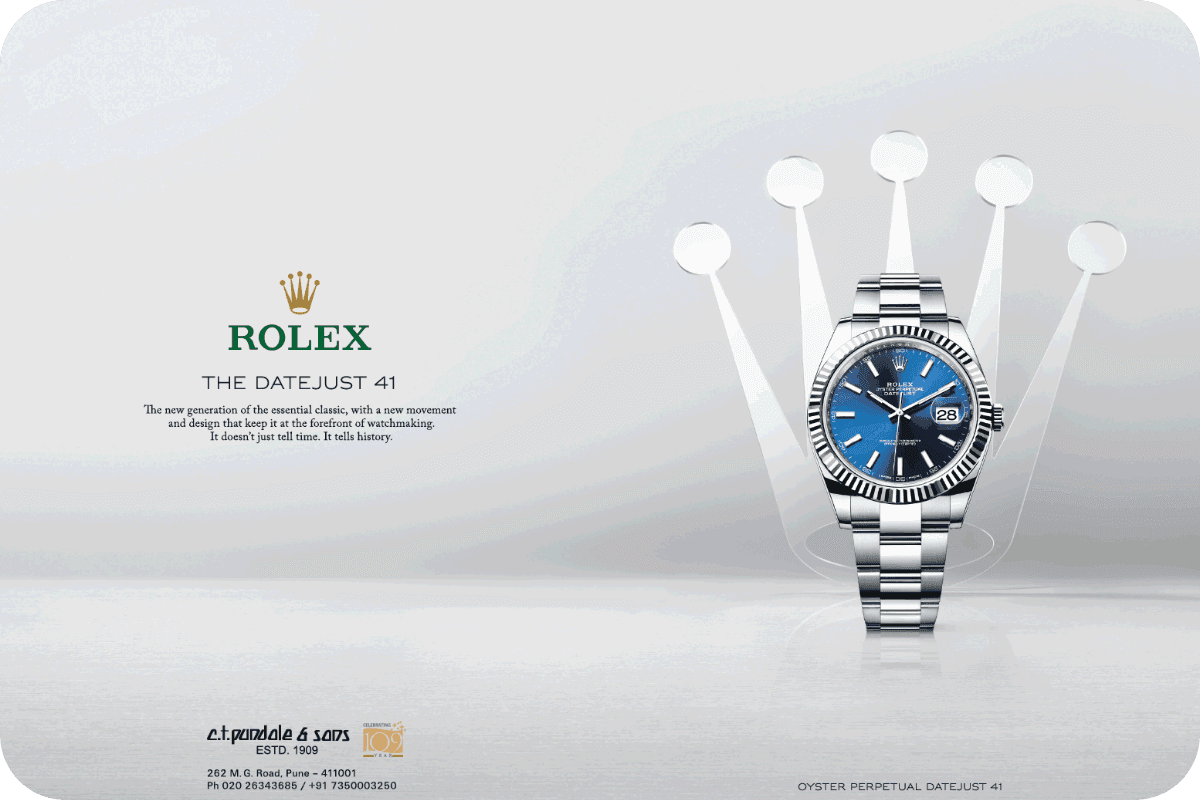
(Source: Newspaperads)
Excitement
Exciting brands pulse with energy and innovation. They're bold, spirited, and often push boundaries. These brands tend to be contemporary and daring, appealing to audiences who value creativity and new experiences.

(Source: Ads of the World)
Competence
Competent brands emphasise reliability and excellence. They build trust through demonstrated expertise and consistent delivery. These brands often focus on quality, intelligence, and success, appealing to those who value dependability and professional achievement.
(Source: Newspaperads)
Ruggedness
Rugged brands embrace strength and authenticity. They often connect with outdoor lifestyles and adventurous spirits. These brands emphasise durability and resilience, appealing to those who value independence and exploration.

(Source: WWD)
Visual value alignment
The visual tone of voice encompasses numerous design elements that collectively express brand identity and personality. A brand's visual identity should authentically embody its core values, creating a seamless experience that resonates with target audiences. Typography plays a particularly crucial role in establishing brand character through thoughtful font selection and arrangement, significantly impacting readability and audience engagement.
Imagery that aligns with brand traits enhances storytelling capabilities and helps establish deeper emotional connections with audiences. Imagery that resonates with your brand's values, audience expectations, and successfully generate positive emotional associations tell better stories that actually stick with people long-term.
Visual tone essentials
Your visual tone of voice brings your brand's personality to life through different elements working together. From your colour schemes to typography and imagery, these pieces combine to create a visual identity that grabs attention and builds emotional connections with your audience.
Colour scheme
Colour schemes are powerful brand tools that instantly communicate who you are. A carefully chosen colour palette helps people recognise your brand whilst triggering specific emotional responses. The psychology behind your colour choices shapes how people see and interact with your brand.
In colour psychology, each hue carries emotional weight and cultural significance. Blues bring out feelings of trust and stability - perfect for banks and professional services. Reds spark passion and urgency, making them brilliant for brands wanting to inspire action or show energy and excitement.
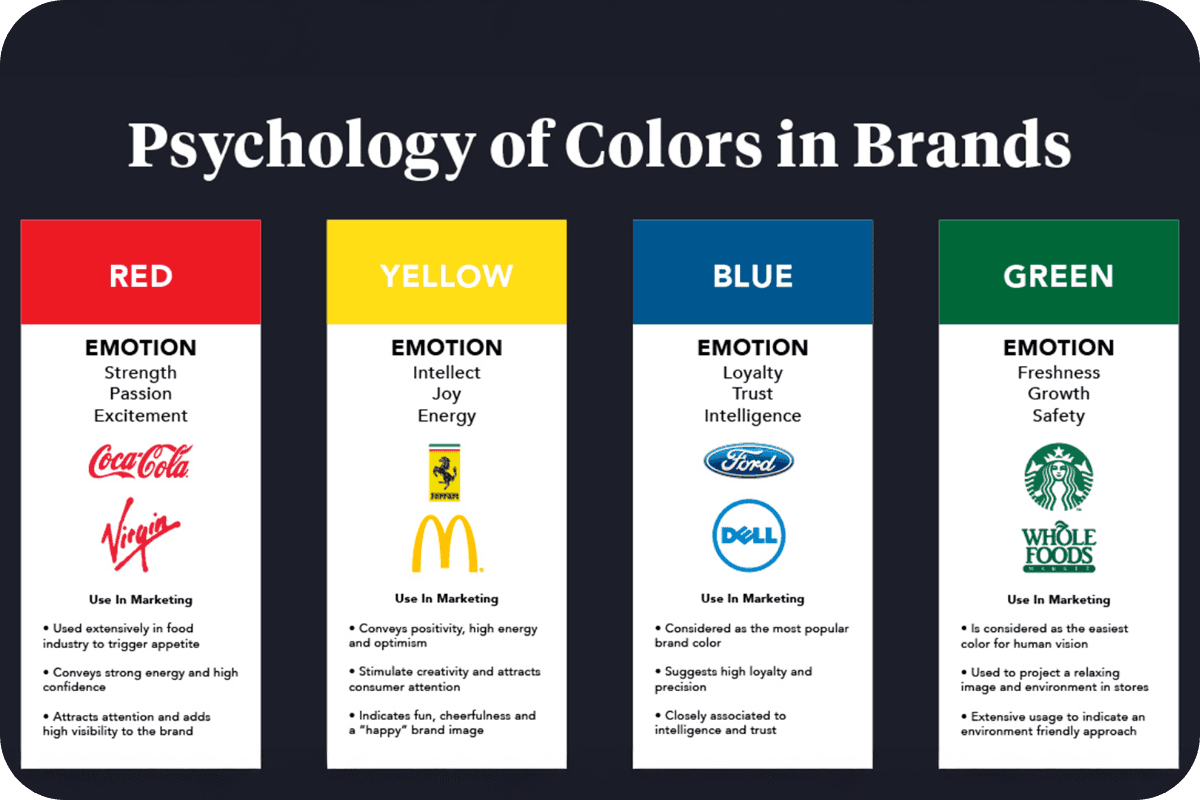
(Source: Corona Todays)
Typography
Typography extends beyond aesthetic font selection; it fundamentally shapes how audiences process and interpret your brand's communication. Every swoop and curve of your chosen typeface tells potential customers something about who you are. Your font choice speaks volumes about your brand's personality too - it can make you feel trustworthy, innovative, or friendly (whatever you're going for). Typography carries significant emotional influence that is capable of evoking specific feelings and associations that reinforce brand values and personality traits.
For example, a playful, rounded font effectively conveys approachability and friendliness, whilst a sleek, modern typeface suggests innovation and forward-thinking.
Imagery styles
Your brand's images need to match who you are - it's really that simple. Think of your imagery as another way to tell your story without saying a word. Your visuals should feel like they belong with your brand, not like they've crashed the party uninvited. They need to reflect what makes your brand tick and what you stand for. After all, when your images hit the right note, they make your brand stick in people's minds and give them a reason to trust you. Get this right, and your target audience will feel like they're seeing an old friend every time they spot your content.
For example, brands focused on innovation might leverage futuristic, cutting-edge imagery, whilst those emphasising sustainability might incorporate natural elements and eco-conscious visual themes.
Key considerations for your visual tone
Your brand needs to look good everywhere - and that starts with getting the basics sorted. Start by deciding how bold you want to go with your colours. Consider the vibrancy levels in your imagery; determine whether your visual presentation will lean towards colourful vibrancy or neutral sophistication to align with target audience expectations and preferences.
Then, move on to determining photographic profiles. There must be clear rules around image treatment, including decisions about colour versus black and white photography, saturation levels, and consistent filter applications across all visual content.
Finally, make sure your look works everywhere. Your brand needs to maintain its impact on a tiny phone screen or large desktop monitors.
Unifying visual and verbal identity
A compelling brand identity combines both what people see and what they hear from you. While visual elements create immediate recognition and emotional impact, they must harmonise with the brand's verbal expression to create a cohesive personality that resonates with audiences. This alignment between what people see and what they hear from a brand creates a powerful multiplier effect that strengthens brand recognition and recall.
Think of your brand voice as your company's personality expressed through words. Much like your visual identity, your voice shapes how people perceive and connect with your brand across every touchpoint - from social media and website content to emails and advertisements. A streetwear company might use urban slang to connect with their audience, while a luxury car manufacturer opts for sophisticated language that reflects their premium positioning.
Brand voice differs from tone in an important way. Your voice stays consistent, like your core personality, while your tone adapts to different situations - just as you might speak differently at a celebration versus a serious meeting. This flexibility within consistency helps brands maintain authenticity while showing emotional intelligence across various contexts.
Voice consistency
Think of your brand voice as your company's personality expressed through words. Much like your visual identity, your voice shapes how people perceive and connect with your brand across every touchpoint - from social media and website content to emails and advertisements. A streetwear company might use urban slang to connect with their audience, while a luxury car manufacturer opts for sophisticated language that reflects their premium positioning.
Brand voice differs from tone in an important way. Your voice stays consistent, like your core personality, while your tone adapts to different situations. This flexibility within consistency helps brands maintain authenticity while showing emotional intelligence across various contexts.
Getting your brand voice right and keeping it consistent is like having a strong personality - people know what to expect from you. Good guidelines help everyone on your team understand your values and style, and workshops can be brilliant for getting everyone on the same page.
Brand voice examples in action
Here are three distinctive brands that showcase how powerful a well-crafted voice can become for market differentiation and audience connection.
Mailchimp
Mailchimp structures their brand voice around four fundamental principles: straightforward communication, authentic engagement, skilled explanation of complex ideas, and subtle wit.
Their communication maintains clarity and accessibility whilst incorporating understated humour that never feels forced. This approach emphasises positive language and deliberately avoids technical jargon, making complex marketing concepts accessible to their audience. The overall effect creates a brand personality that comes across as knowledgeable yet approachable, offering support whilst maintaining professional credibility.

(Source: Mattvandzura)
Visually, their billboard campaign reflects this personality through whimsical imagery of ivy-covered legs in colorful socks and sandals, set against a bold yellow background. The contrast between professional copy ("All-in-One Marketing Platform") and the playful visual creates an approachable yet credible presence. Overall, their visual tone employs:
Bright, optimistic colors that feel welcoming
Quirky, unexpected imagery that sparks curiosity
Clean, organised layouts that maintain professionalism
Strategic use of white space to keep messages clear and digestible
Oatly's bold authenticity
Oatly revolutionised their market sector through distinctive messaging characterised by sharp wit and self-aware humour. Their copy-first approach to branding demonstrates confident, concise communication that challenges industry norms.
Their packaging and marketing materials showcase this distinctive voice through bold statements and conversational asides that break traditional marketing conventions. This approach has created a uniquely recognisable brand voice that resonates strongly with consumers seeking authenticity in their brand interactions.

(Source: Medium)
Oatly's billboard visual, taking a copy-first approach, perfectly mirrors their verbal directness through:
High-contrasting black and white design that maximises impact and cuts straight to the point
Large, commanding typography that demands attention and doesn't compete for the spotlight
Minimalist composition that lets the message take center stage, taking a confident 'we already know you're paying attention' approach
Deliberate use of question marks and casual language to create conversation, showcasing their break-free-from-convention personality
Spotify's cultural connection
Spotify maintains an approachable yet contemporary brand voice that reflects their deep understanding of modern culture. Their communication style demonstrates cultural awareness whilst maintaining an accessible, relaxed tone that appeals particularly to millennial audiences.
Their brand voice succeeds by matching their target demographic's communication style, creating natural resonance with their core audience. This alignment helps distinguish them within their market sector whilst building authentic connections with users.
(Source: Ad Age)
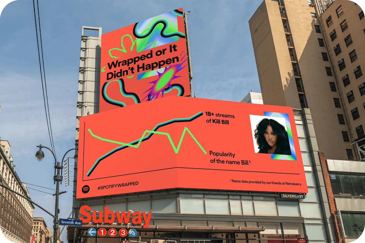
Their 'Wrapped' campaign billboard blends data storytelling with pop culture, creating an eye-catching display that speaks directly to their digitally-native audience. The visual elements working together to reinforce their contemporary identity within this billboard includes:
A vibrant coral background that feels fresh and modern
Dynamic data visualisation that charts the inverse relationship between 'Kill Bill' streams and the popularity of the name "Bill" - a clever way of turning user data into cultural commentary
Holographic-style decorative elements that add contemporary flair
Each of these brands demonstrates how consistent, well-defined voice and visual characteristics can create distinctive market positioning and meaningful audience relationships. Their success highlights the importance of developing and maintaining a unique brand personality that authentically reflects company values whilst resonating with their target audiences.
Making it all click
Brand cohesion happens when visual and verbal elements amplify each other's impact rather than simply coexisting. This synergy creates a multiplier effect - when your visual choices reinforce your verbal messaging, each element becomes more powerful than it would be alone. The result is a brand expression that feels intentional rather than incidental.
This partnership between visual and verbal elements operates on both conscious and subconscious levels. At its core, it's about creating a seamless psychological bridge between what people see and what they read or hear. When these elements align, they create deeper neural connections in your audience's minds, making your brand more memorable and meaningful. When you get this right, every piece of your brand feels natural and cohesive to your audience.
This partnership between visual and verbal elements works in ways you might not even notice:
The fonts you pick set the tone for how formal or casual your writing should be
Your color choices influence the emotional impact of your messages
The types of images you use help decide whether your voice should be serious or laid-back
Even the way you use space affects how your words flow
Final word
Every tiny bit of your brand - from how your fonts look to how your words flow - team up to leave a mark on people. When what they see matches what they hear from you, that's when the magic happens. Your brand becomes impossible to forget and actually means something to people. They stop being casual scrollers and turn into authentic brand advocates.
If you're ready to build a brand that speaks volumes through both its look and voice, book a call with our founding Gurus, Will and James to help you develop a comprehensive visual identity that aligns seamlessly with your brand's personality and resonates with your target audience.

Cailyn works across digital marketing and content creation, producing social media content, blog articles, and marketing materials. She has a keen interest in brand storytelling and audience engagement, ensuring content is both impactful and aligned with marketing goals.